
Creative Cortex
Product Design, Web, B2B
Introduction
Overview
Creative Cortex is a node-based canvas that lets marketing teams generate assets and build reusable AI workflows.
The goal: give non-technical marketers hands-on experience building with AI in a collaborative capacity, not just generating one-off assets, but composing, comparing, and reusing the workflows behind them.
My Role
In a team of three, working alongside two engineers, I personally:
Owned the product design of the canvas: the interaction model, the module system, and the end-to-end flow.
Designed and built the frontend, shipping the node, chaining, and template systems to production.
Condensed technical workflows into something a non-technical marketer could use unaided.
Timeline
4 months
The Problem
Marketing teams struggle to collaborate when working with generative AI tools.
Observations
I worked directly with marketing and creative product teams to train them on how to prompt AI models for asset ideation and creation. I observed that using traditional chat-based tools made it very difficult for them to collaborate and share their processes and ideations.
They generated assets in chat-based tools: ask, refine, repeat, in a linear timeline. The process works fine for a single throwaway image or as a party trick but quickly breaks down the moment teams want to learn from each other or they attempt to work through more complicated iterations as creative teams often do.
Core issues
The same four problems surfaced multiple times with the teams I worked with. I treated them as the baseline that design had to solve.
01
Hard to get it right
Refinement is clumsy and linear. Every tweak means losing sight of the previous iteration
02
Easy to get lost
Assets scatter across chat threads that quickly multiply as iterations and asset variations are produced.
03
Hard to compare and edit
No side-by-side, no branching, users can’t hold two options up against each other.
04
Impossible to collaborate
Chat is single-user. A workflow can’t be shared, forked, or built on as a team. Group conversations quickly get messy.
Node-based workflows
Using generative AI allows users to get a quick visual proof for their ideas. Many brainstorming techniques and design frameworks involve branching out to think of many different possibilities at once before refining to an outcome. With generative AI, there is a clear loop of prompting, evaluating, refining, and reprompting.
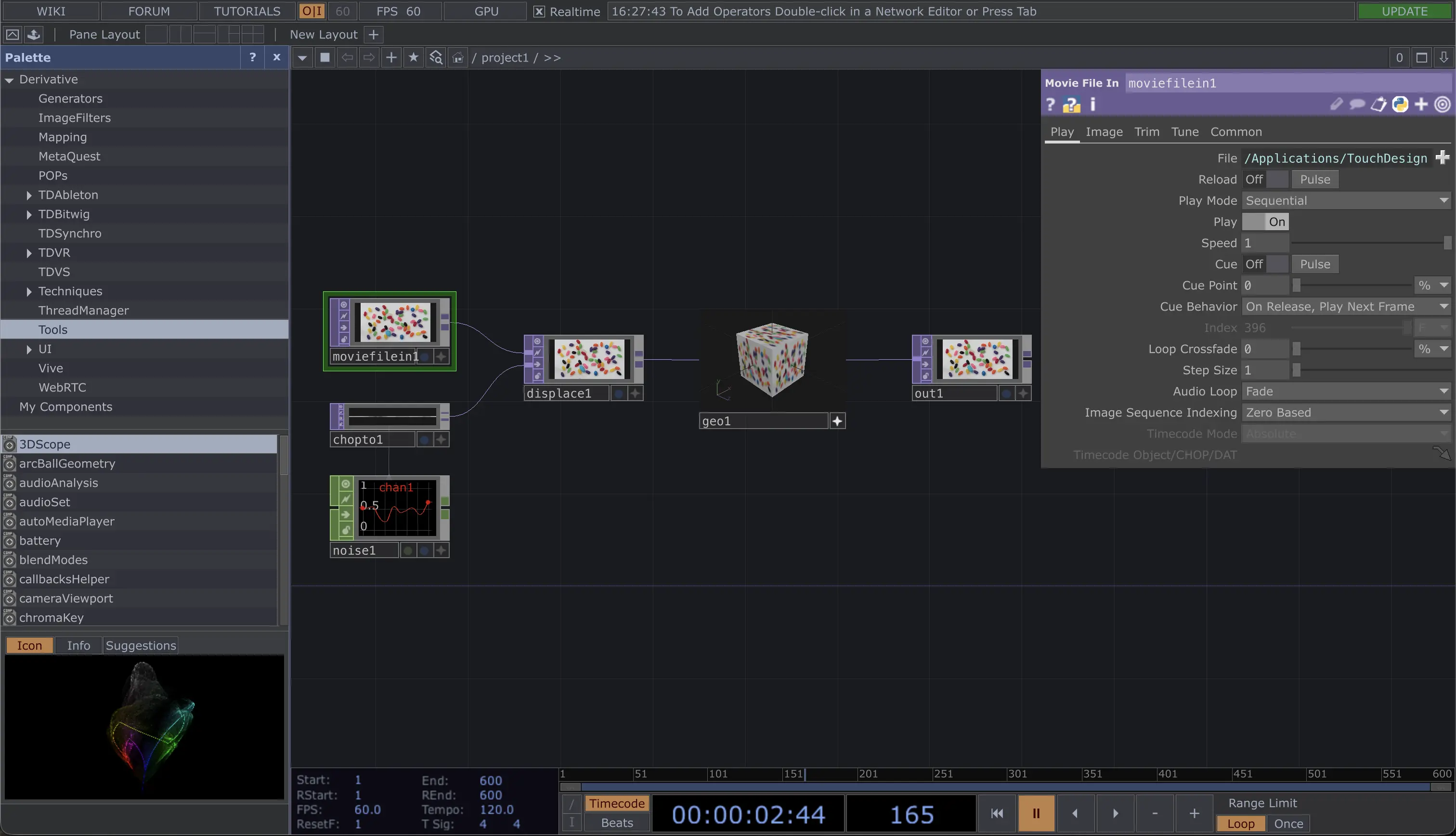
These two core aspects pushed me toward the structure of node-based interfaces. Because of my experience with TouchDesigner, a node-based tool for creating interactive art and programs, I am very familiar with how they function but I remember how intimidating it was when I started out. The core concept is intuitive, nodes link together to form chains of executions, but in practice users struggle to unlock their full potential because of the steep learning curve.
Comparison
When comparing based on the issues we discussed, a node-based interface has the opportunity to easily solve many of them.
Editing a prompt overwrites the last.
Trace the exact path to any result.
Outputs are stranded in their own isolated thread.
Outputs and ideas sit side by side for quick access.
A linear path makes iterating fluidly difficult.
Branch anywhere to test many options in parallel.
Attempts pile up and get lost across endless threads.
A spatial canvas keeps every attempt in view.
Unable to compare or build off of anyone else's work.
Teammates can fork and build on each other's work.
Easy for anyone to start typing.
Requires learning to chain nodes.
Goals
A chat-based interface is inherently easy to use since we already email and message on our devices constantly. It is easy to jump in and start typing. The structure of a node-based workflow naturally inherits the ability to improve all other issues, from visibility and comparison, to organization and collaboration.
The node-based interface provides the optimal structure for a collaborative tool, but the floor is high to get started and the learning curve is steep. This project focuses on building out the internal features to lower the floor and ensure the users can easily start creating, exposing complexity as they learn and improve.
The Module
The nodes on the canvas can either be modules or assets. They link together to create chains which users expand on. The nodes need to be as simple as possible without preventing power users from achieving their full potential.
The core structure
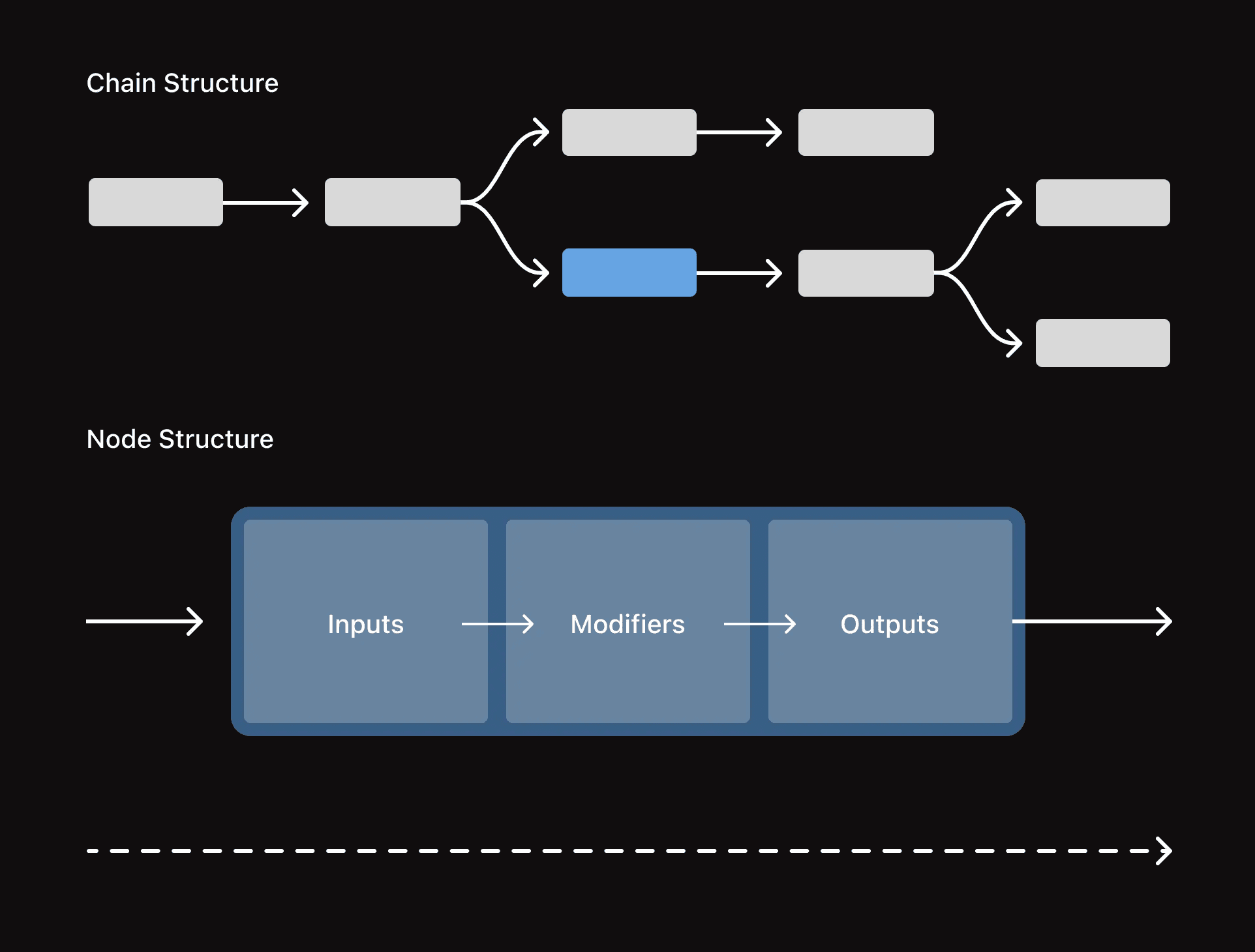
I found that node workflows naturally evolve left to right while branching out like a tree, it is an intuitive way for users to work through iterations having the base be on the left and then progressively working towards the right as the ideas evolve.
The modules that make up the chain should therefore inherit the same structural rules with content flowing left to right.
Horizontal axis
Across → content
Input → prompt → output, left to right. A module acts as a miniature chain.
Vertical axis
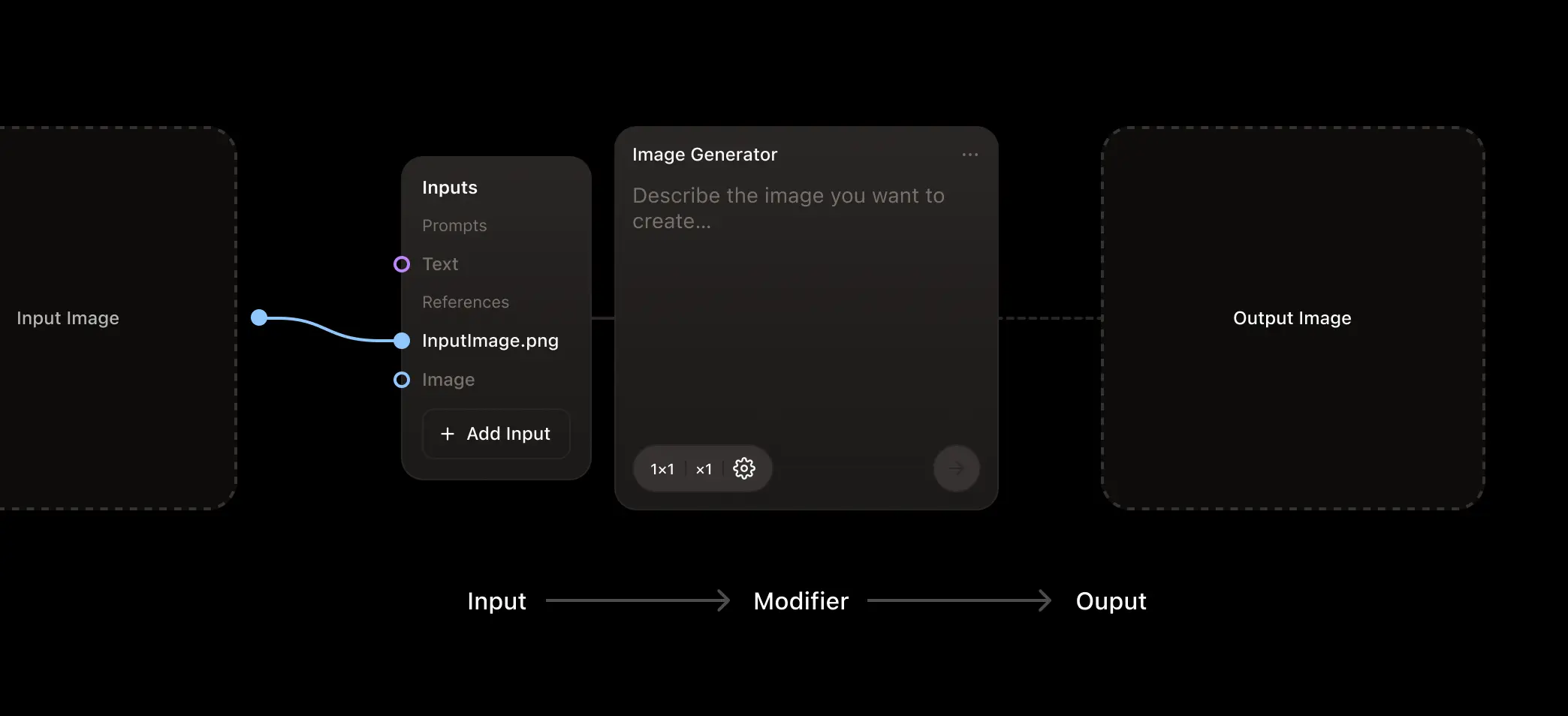
Down → time
History (past outputs) sits above the prompt; settings (future output) sit below. The vertical axis of the module acts as a timeline for the data surrounding the given module.
Low floor by default
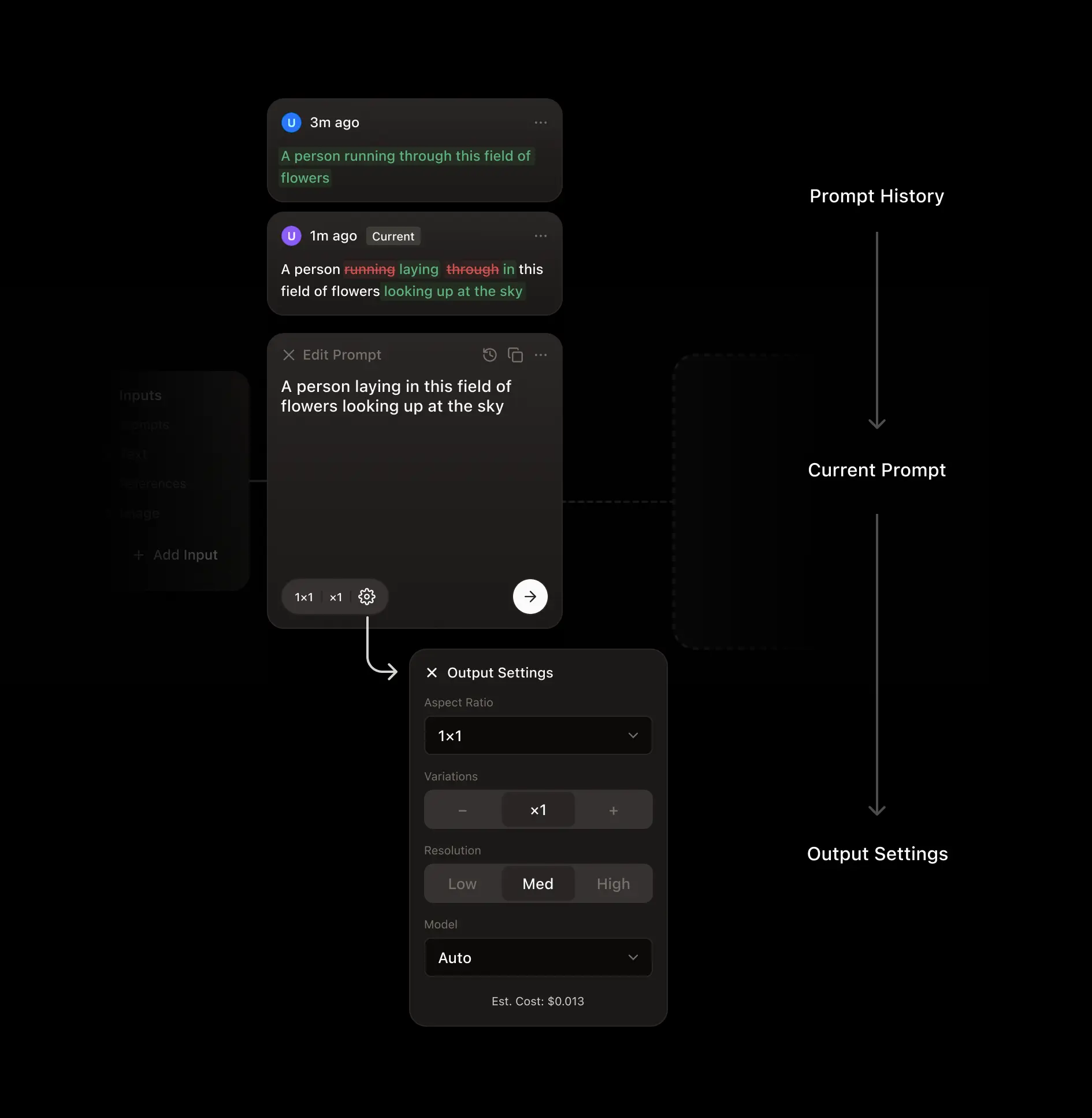
The core module shows only what a beginner needs: the data inputs and a prompting box. Advanced inputs, settings, and history stay hidden until they are needed.
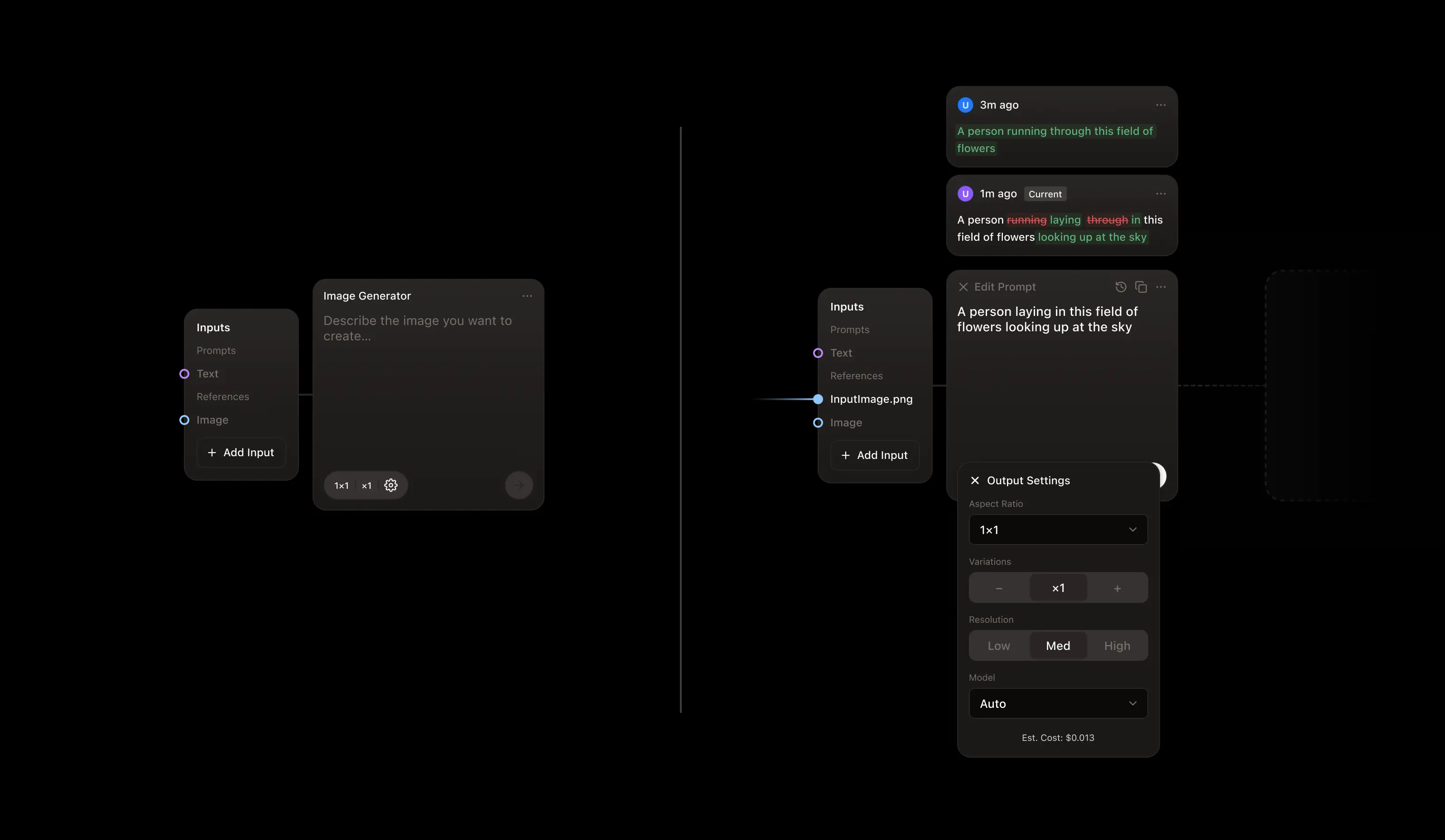
The input panel
Decision 1
All external effects live in the input panel
Prompts, reference images, uploaded files, upstream outputs, styles, and brand packs all arrive through and can be organized in the same input model. There is one place to look when modifying the content the module has to work with. Brand consistency becomes just another input you pick alongside references.
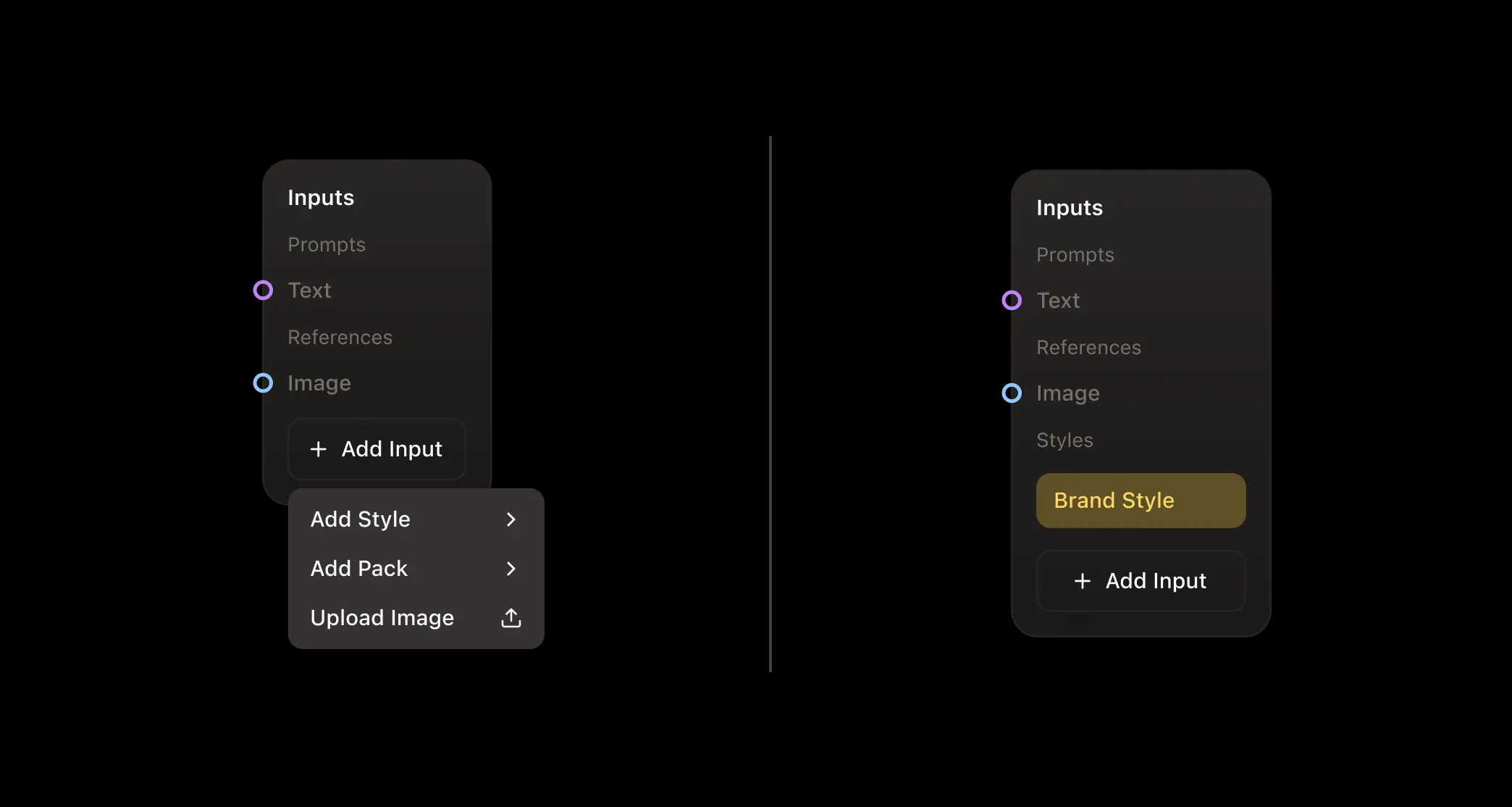
Decision 2
Dynamic layout
Just like the module as a whole, the input panel starts simple and then expands to reveal options and inputs when necessary. At first only the ports you drag to sit up front with the more advanced options sitting under the "Add Input" dropdown. When attaching a style or reference pack using that dropdown it then appears above the fold in its own section. Inputs for the Prompt and Reference sections automatically reveal additional slots as elements get connected, growing as users interact with them.
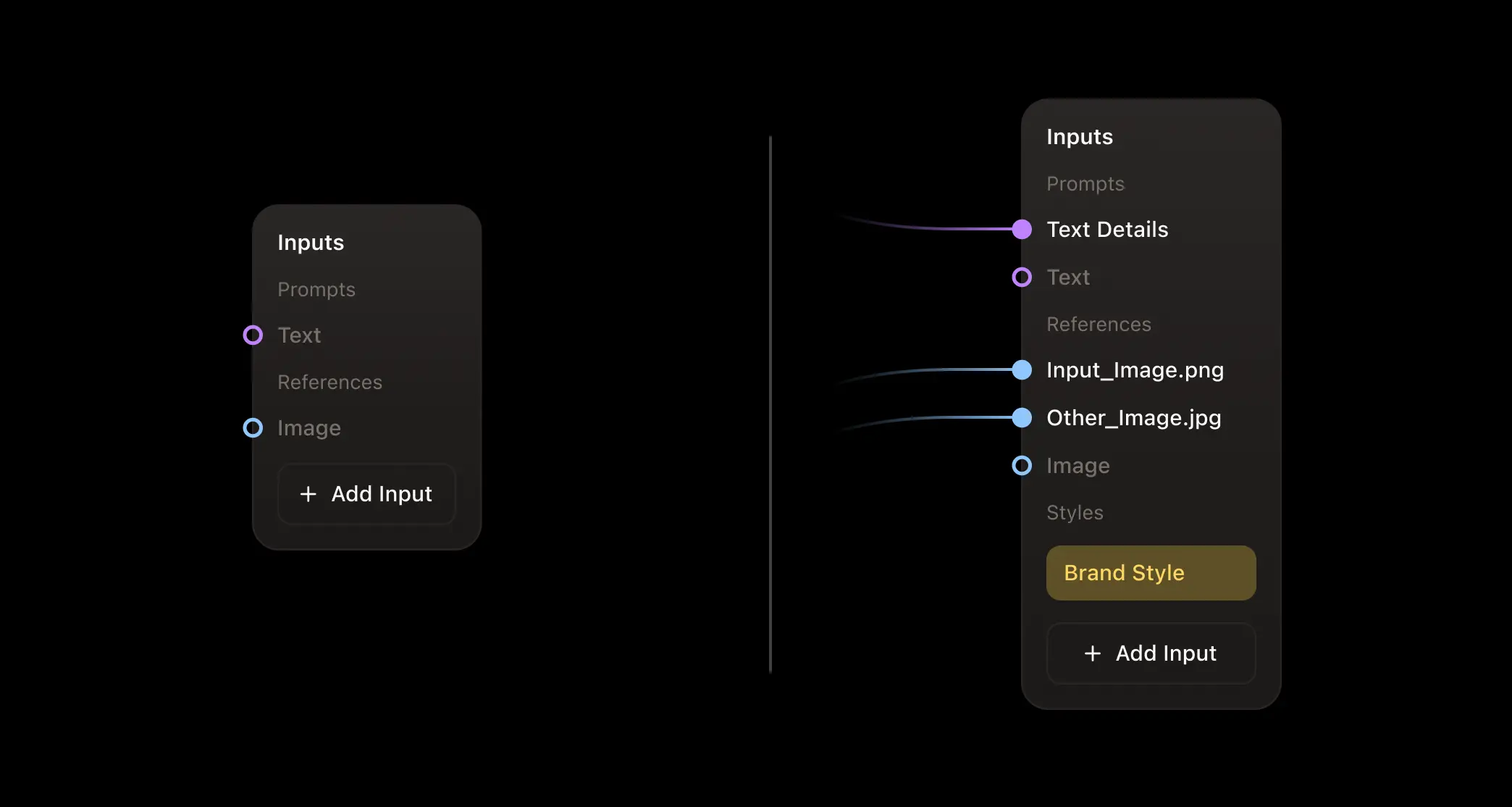
Decision 3
Toggle input types directly from the panel sections
For modules with multiple distinct input modes, users can toggle between them directly from the section within the panel keeping the control centralized.

The action bar
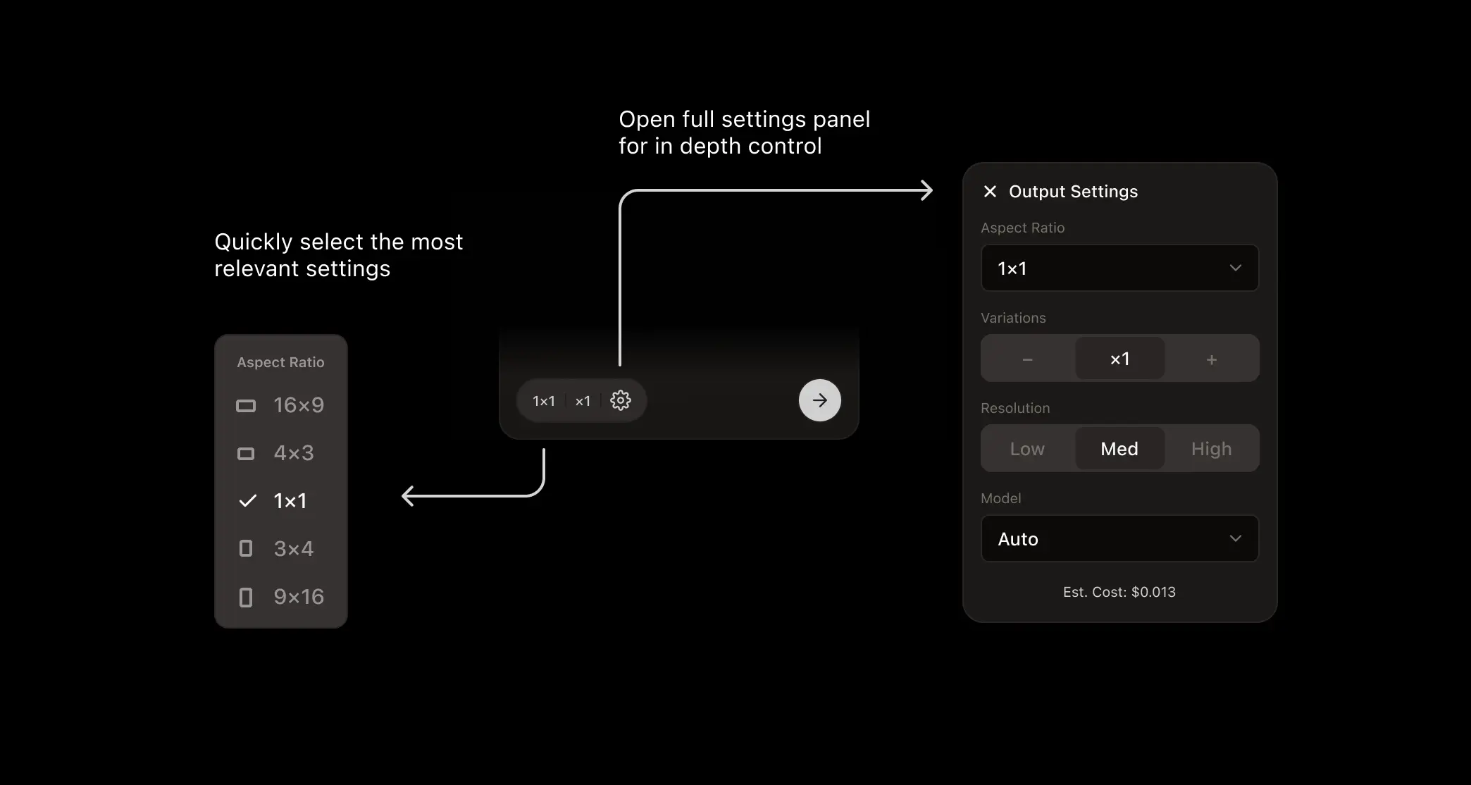
The action bar sits at the bottom of the main node. This bar is the final checkpoint before an asset is created, so it dictates and informs on the output. It primarily contains the output settings and the generate button but can shift depending on the state of the module. The settings shown in the quick settings pill switch depending on the module, for video, for example, users can quickly configure video length in addition to aspect ratio and variations. Once the module has generated an output the module switches to a generated state and the action bar lets users rerun the prompt or go in to edit.
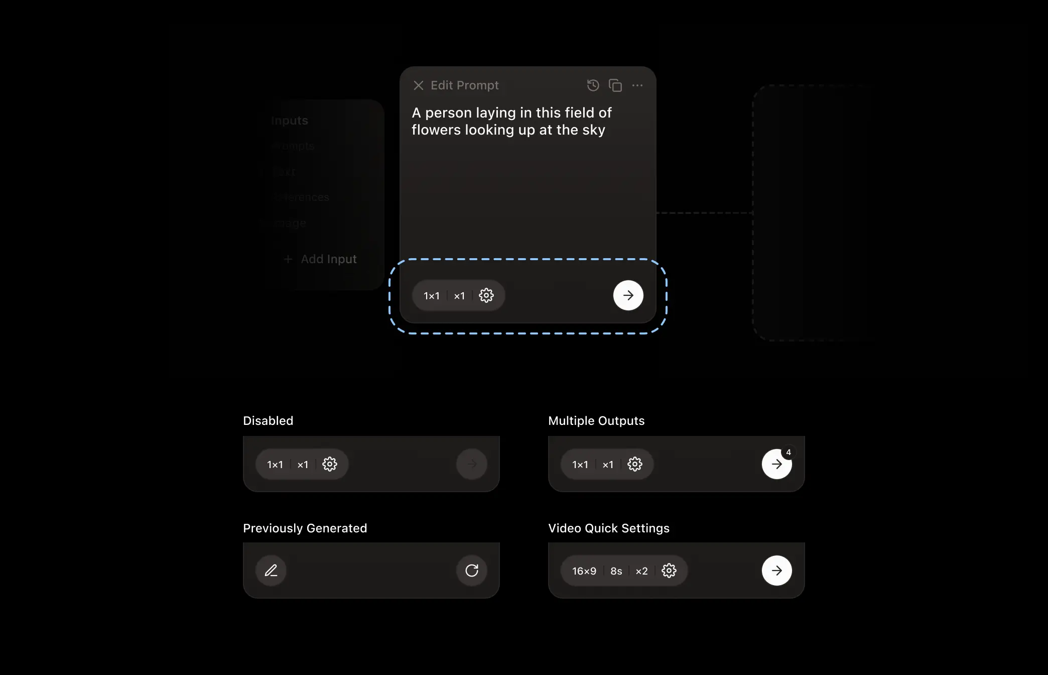
Settings follow the low-floor rule twice over. A quick-settings pill in the action bar surfaces the two or three controls people actually reach for the most. Tapping them opens a modal to quickly switch that option. This reduces the need to open the full panel, speeding up iterative refinements.
Scaling Up
Learn the grammar once, and the same moves scale — from one asset to your whole team.
Asset Collections
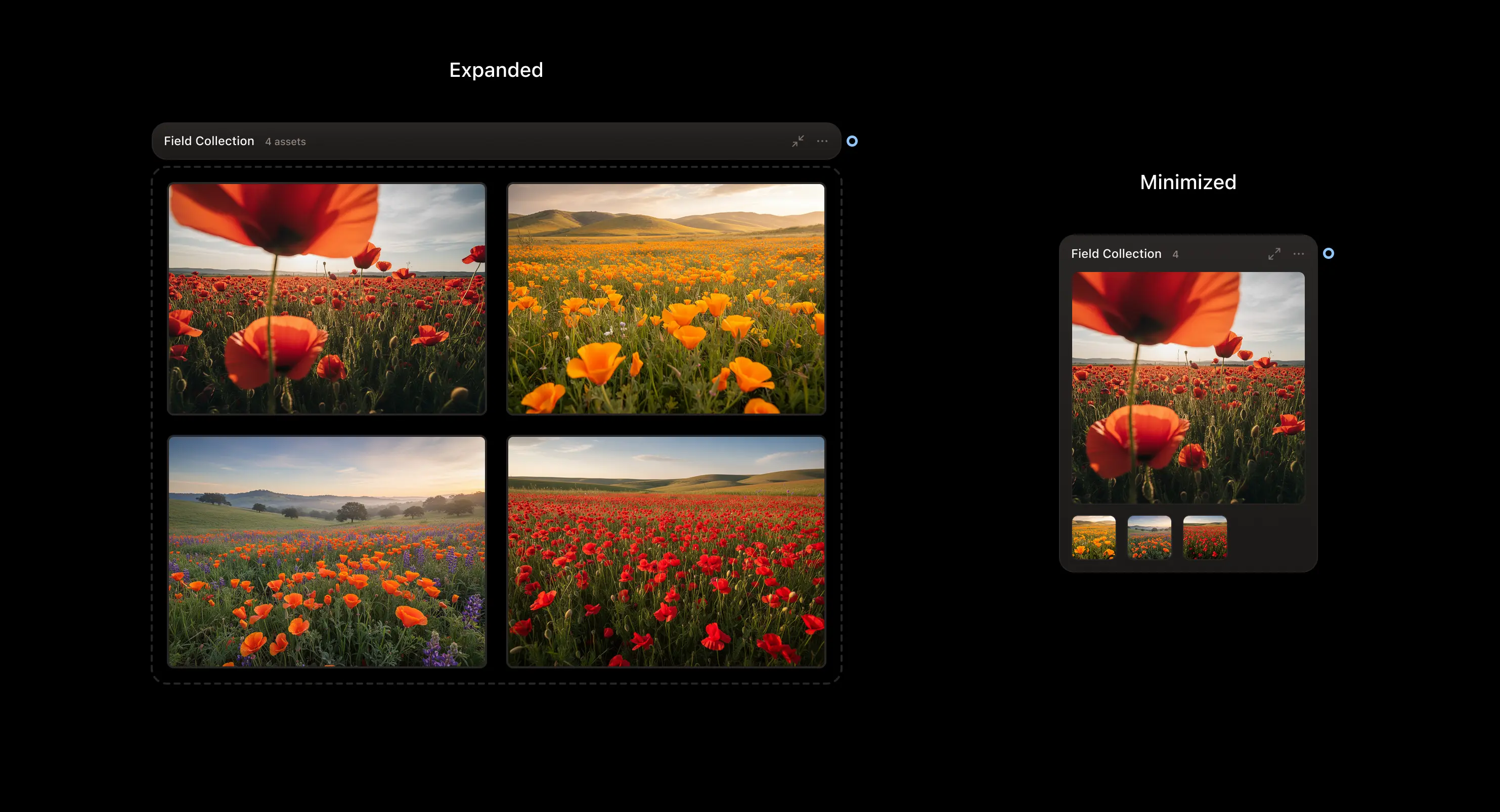
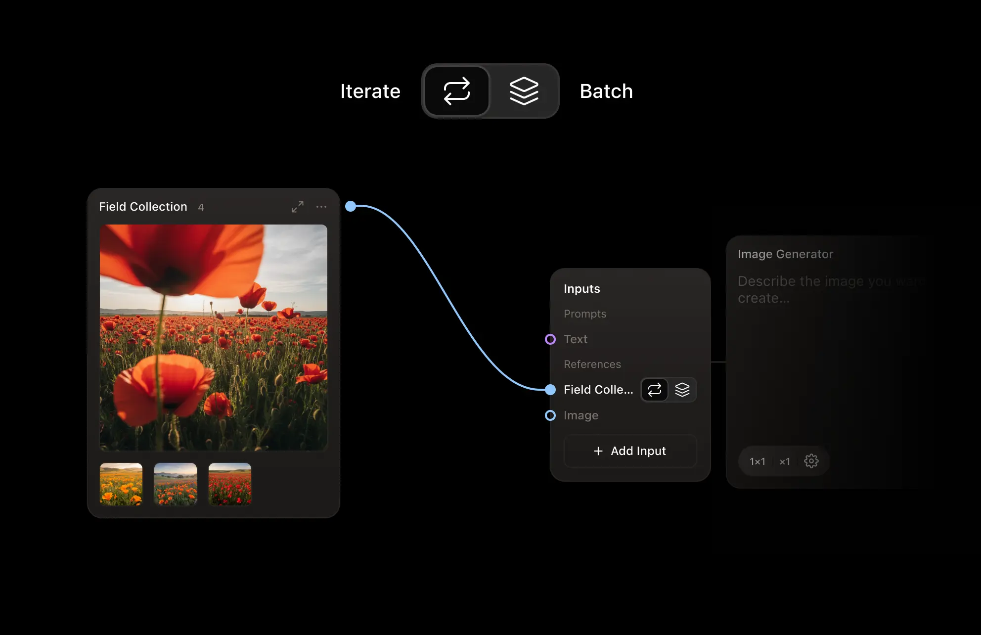
Collections allow users to group assets together. Variations from a single module group automatically into one node, which makes comparing options effortless. Users can create custom collections as well and use them to feed downstream modules two ways: they can iterate one workflow through multiple assets one at a time, or hand the whole set over as a single batch to be analyzed all at once.
Job 1
Organize
Collapse to one hero asset to keep things clean, or expand to a grid to compare side by side.
Job 2
Aggregate and Loop
Send multiple assets downstream to run the workflow on the entire collection one at a time, or batch them together to allow the workflow to analyze them all at once.
Templates
The second way things scale is reuse. A working chain collapses into a single node the whole team can run. The expert builds the pipeline once, then places input and output nodes inside it to author exactly which controls appear on the outside — so a used template looks and behaves like any other module: same collapsed card, same input panel, its complexity hidden but one click away. You save what works, and hand the team a one-click superpower — the reuse payoff a chat tool could never give.

Reflection
Results from the pilot implementation
I tested working builds with the same marketing teams that I originally trained, against their old chat workflow.
It is easy for anyone to simply generate more assets. The real question we wanted to answer was whether teams reached an approved asset faster, with less waste, and more range. We were able to measure these statistics with the pilot teams against their old chat workflow. (Directional estimates from the pilot, not exact figures.)
60% ↓
Fewer dead-end generations
runs that ended without an approved asset
Parallel branches and side-by-side comparison let people keep the good directions instead of hitting a wall.
25% ↓
Fewer iterations to an approved asset
75% fewer when the workflow was a saved template
History is never lost and proven pipelines get reused, so teams learn from each other’s attempts.
What I learned
Working on Creative Cortex taught me that the limit of a creative tool is not necessarily the power of the tools but rather the extent to which it makes people feel free to explore.